
Shopify Conversion Rate Optimization
The Ultimate Ecommerce Guide to Increase Sales from Drive-By Visitors in Shopify
by Joshua Uebergang of Digital Darts
by Joshua Uebergang of Digital Darts
“The first rule of any technology used in a business is that automation applied to an efficient operation will magnify the efficiency. The second is that automation applied to an inefficient operation will magnify the inefficiency.”Bill Gates
Someone will not convert if the website does not let them take the required actions to convert on their device. It takes more effort than a test booking from your browser to snipe technical bottlenecks so the purchase experience is a breeze.
Technical conversion optimization looks at the usability of your store in a variety of situations then covers ways you can use technologies to turn a visitor into a sale. Adjustments can cause a surge in sales when the issue affects a lot of users. Fixes for an unpopular device or browser accumulate to cause an uptick in sales, while also reducing customer support tickets that are hard to solve.
Store speed correlates with revenue per user. Many tests prove the correlation time and time again across all types of business.
Walmart found: “For every 1 second of improvement they experienced up to a 2% increase in conversions” and “For every 100 ms of improvement, they grew incremental revenue by up to 1%”.
Excellent servers are critical to a lightning fast store. Shopify was the first hosted ecommerce software to use a content delivery network (CDN). A CDN has servers placed around the world so visitors pull and push data to the nearest server. The server speed is taken care of for you.
One area non-technical store owners and marketers can optimise is images. Use the right image format and compress quality. Screaming Frog is one way to identify large image files. GTmetrix and Google’s PageSpeed insights tool provide charts to see slow images as well as other reasons a page lags in performance.
Also analyse the time it takes for a user to be able to interact with the website, which is known as first input delay (FID). A faster FID gives the impression of a faster loading page. The FID metric can be gathered from Google’s PageSpeed Insights tool.
Work on your slowest pages that get the most views. Google Analytics 4 does not have a native report for website speed so you can set up your own customizations to identify slow pages.
The majority of speed optimization has to do with your theme. A good developer can refactor CSS, reduce apps, replace images with CSS, concatenate files, and minify files. See my guide on common SEO mistakes for ways to speed up your Shopify store.
If your visitors were told to find one product, would most find it within 20 seconds? How about you actually find out with a HIT on Mechanical Turk.
Links on your website connect the user experience. The old rule of “the user should be able to find anything within three clicks of the home page” is a load of rubbish. You can have everything accessible in three clicks and still befuddle people at where to find information. Depth is unrelated to clarity.
Place links to key pages like contact, returns, and postage in the footer. Consider testing the collections displayed in the header rather than lumping them together under “Shop”. Test a link to your standout product at the top.
The most important part in ecommerce architecture is the categorization of products. You don’t want a product to slot into multiple collections that are meant to differentiate products. Do you know the difference between “Custom Options” and “Custom Stone Options”?

What’s the difference between navigation links in one shop that are “By Category” and “By Collection”?

A good categorization structure helps conversions, SEO, and possibly average order value. You get it right when your visitors look at your collections then quickly know where their product is most likely to be.
The process of good categorization depends on store size. A store with less than 200 products can list all product names in a spreadsheet then group similar ones under a column. Large stores with diverse SKUs can model Amazon or eBay and get ideas off competitors.
Well-organised collections can be brands like Ben Sherman, Timberland, and Under Armour or be made of interests like basketball, netball, and tennis. Do not use product attributes and minimise adjectives in a collection name like “Adidas Basketball Black” as it leads to an overwhelming navigation bar.
The order of your product categories affect sales. Put your most important collections first from left-to-right or top-to-bottom based on page views. Group similar navigation elements to help visitors identify products.
Create a report that lets you see the views of collections. In Google Analytics, go to “Reports” > “Engagement” > “Pages and screens”. Change the dimension to “Page path and screen class” then filter by “collections”.

Explore the verbiage for navigation links. Designer Marta Eleniak talked one company out of calling their “Personal Vehicle Leasing” product “Just Drive” (whatever that means). Enable people to easily find the products they want.
A breadcrumb is the trail of links that tell someone where they are on the website. See an example on RadarMount.

Imagine you did a Google search for “car mount camera” then came across RadarMount’s product. You also want something made for your phone, but you see the breadcrumb then click “Suction Mount Device Brackets” to find other options.
Breadcrumbs cut user anxiety, reduce bounce rate, and assist SEO. A breadcrumb provides context for the user at no cost. Jakob Nielsen has recommended breadcrumbs since 1995, “Breadcrumbs never cause problems in user testing. Users pay attention to breadcrumbs only 30% of the time; when they do, it helps and even when they don’t, it doesn’t cause any harm.”
A descriptive URL reassures a visitor they are on the right page. What could be at this URL? Something about New Balance.
example.com/collections/new-balance/43545
You know exactly what is at this URL:
example.com/collections/new-balance/purple-packer-new-balance-shoes
A miss-match or lack of clarity can hurt conversion. You also improve SEO with clear URLs that match the page. A hidden conversion benefit of a descriptive URL is you help someone locate the page when they try to revisit it in their browser window:

One study found people who search convert 1.8 times better than non-searchers and bring in a disproportionate amount of revenue. Zohar, CEO of Fast Simon that provides search functionality to Shopify stores, tells me this stat is far below their data for thousands of stores. He says people who search convert anywhere from 2-10x better than non-searchers.
I agree with Zohar’s data looking across the stats of my clients. One random client I looked at with a SKU count of 1,500 has searchers convert at 6.42% compared to 2.32%—a 277% difference.

Internal search matters most on websites that have a large product range or products with intricate details like shoes and jewellery. Search can bandage poor website architecture—overcoming bad navigation and filters—so the best action is to stop the bleeding at the source.
How you implement search is as critical as having an internal search option. A study by SLI Systems found 25% of shoppers refine their search query after their first search and another study learned 73% abandon the site after 2 minutes if they cannot find what they want.
Here are ideas to explore search that have worked for my clients:
You can do all this with Fast Simon. It is my favourite search app on Shopify.
Nothing is more frustrating when you find great shoes or clothes, but the product page clarifies they are not made in your size. I’m 6’9″ and have been there many times.
Options make decisions hard. We handle complicated situations with inaction.
Help shoppers find what they want with filters when your store has product options that are complex or apply to groups of people. The collection filter app helps a lot of Shopify stores with filter functionality and design.
Digital Darts’ client Blue Bungalow has a clear filter that opens when “Filter” is clicked. Given the large number of options, the filters are not collapsed to let shoppers see the categories of filters that best fit their needs.

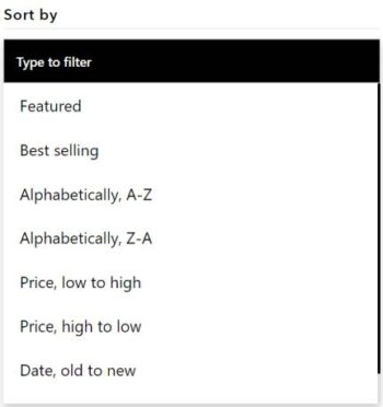
A related part of the filtering system to consider is sorting. Let people sort by bestsellers, price, alphabetical order, and possibly date.
A 404 means the page viewed is non-existent because it was deleted or moved to a different address. You may improve the conversion rate when links and images function as intended as it forms a good user experience.
Rather than click every link or view every image to verify 404 errors, use Screaming Frog to scan your website. Once the tool completes its scan, click on the “Response Codes” tab then sort by “Status Code” to identify 404 errors.

Click the “Inlinks” tab at the bottom to identify where you need to update a broken link or image.
A link from another website that goes to a 404 page can cost you sales, especially if it’s from a journalist or blogger who has pre-sold the reader.
To identify pages that do not exist:
Your report will look like:

The report helped me identify a broken link in my YouTube video on Google Ads conversion tracking in Shopify. The page referrer dimension is limited in information so you may have to do manual digging to locate the exact location of the link.
If a third-party is linking to a non-existent page, the quick fix is to create a redirect. The better option for SEO is to reach out to the website asking them to update what link, on what page, to the correct version.
When you find a non-existent page, how does your store help the sale? Type your store’s address into a web browser with a non-existent address like mystore.com/errortest to check. Allbirds are an example of what not to do:

Control the message by telling the visitor what happened and what to do next. Here are high-converting principles for your 404 page:
Here are some examples of good 404 pages. The best one being yours truly for Digital Darts.


There are thousands of mobile phone models and more mobile phones than people on the planet. Mobile is likely to make up more than half of your store’s traffic. How do you discover when someone on an iPhone 12 is unable to purchase then leaves your store, when they don’t tell you the problem? No foolproof method exists.
The most comprehensive fast way to begin finding mysterious mobile-device problems is in Google Analytics:

It’s ideal to have every page perfect for every mobile user, but you have a budget. Focus on what is most likely to grow your bottom-line:
Online usability tools like BrowserStack and Google’s mobile-friendly tool can purge obvious problems. They claim to replicate mobile device usage, but I’ve repeatedly come across strange problems these tools overlook.
Browser testing is easier than mobile device testing. You can install browsers on your computer then thoroughly test the website.
You are now past half-way through the Shopify conversion guide. Keep going because some big growth hacks are ahead. You are about to learn how to craft product pages that make visitors pull out their credit cards: